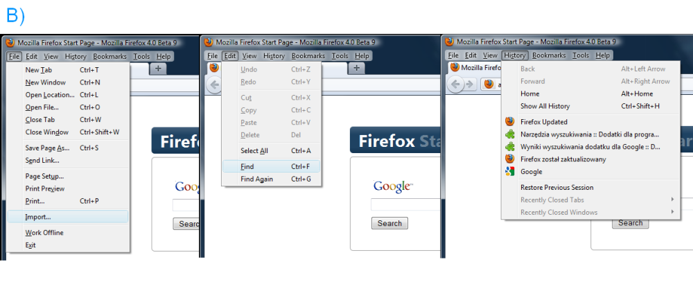
I’d like to introduce my idea for new Firefox menu. I named it Quick Menu just because it’s a quick-access one. My main priority was to decrease count of clicks and distance of mouse movement needed to access any option A). What is more I was focused on enabling fast access to the most options*** yet sustaining old layout, logics and quantity of options so they would remind ones from the old menu bar B).
Main quality of my idea is clever navigation system, whole rest, besides merger Edit and View into one, remains the same. It’s a courtesy towards users’ habits, who enjoyed the old menu system and are used to it. Restricted count of options in non ergonomic, less practical form, in the new Firefox beta menu, becomes quite a weakness in regard to a brilliant idea which is new interface created by Mozilla.
Therefore before I discuss my idea in detail, with respect to all the authors, I’d like to point out deficiencies of current Firefox’s beta menu, that encouraged me to find a solution, which would suit better in my opinion. Right after we roll down the new menu we notice there aren’t as many options as there used to be. It’s clear to me, as whole area got smaller, that the authors tried to sustain the functionality of current menu bar. It’s hardly possible, therefore some options had to be cut out, restricting it’s content to the most commonly used ones. Though you have to have in mind a fact that it’s a disadvantage in regards to the current menu bar, which provided full functionality and therefore was more universal for a wider range of users.
Another disadvantage I find is quickness and ease of accessing several options. For instance in order to find History and Bookmarks, which are very often used by most of the users including me, you have to cover longer mouse distance, aim at the arrow button C) (which is too small for convenience, especially for elders), roll down the menu and then point the option needed.
The problem regarding Bookmarks menu has been solved by placing a Bookmarks button on the right hand side of the window. Access to History is not enabled by any alternative solution unfortunately. It looks exactly the same as access to Bookmarks, besides it’s placed one line below. Due to that Firefox 4 menu in this case in particular is slower and less convenient to use in comparison to classic menu bar. Similar inconvenience in my eyes are options Copy, Paste and Cut situated as adjacent small icons on the same height. Small buttons inside the menu require additional focus during navigation. Personally I think that choosing a desired option should not require any additional focus on the process, it should not force you to point with increased precision. Options equipped with larger button (or active area) foster enabling easier and more intuitive menu navigation.
Shape, small buttons, less options is one, however there’s one useful thing missing such as shortcut keys’ hints. Thanks to them it was convenient for one to easily learn them or just to quickly remind in case they had been forgotten.
I’m aware that I mention relatively small differences, however these are quite disadvantageous in comparison to the old menu bar, which’s only shortcoming was it’s bigger size. All the aspects of the new menu, besides the size, are in huge deficit regarding to the old system.
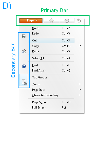
My idea bases on a clever arrangement of option buttons, which decreases mouse movement, count of clicks and makes Quick Menu A) very similar to the old menu bar B). In order to make it possible I’ve used some free space that’s in straight line to the right of the Firefox button. It hasn’t been used in any menu that I know. That’s a place where I put History, Bookmarks. These three mentioned buttons form a Primary Bar D) on the top of the menu. Additionally on the right side of them there’s a Get Back to Start button which resets the navigation position.
Tabs situated on this bar are Primary ones in relation to the Secondary Bar’s ones D) . Primary option with Firefox button on it starts a roll-down menu, where additionally on it’s left side of are placed icons presenting options which form a Secondary Bar. Depending on which current Primary tab is active they allow or disable the access to Secondary Bar’s options. If Primary option Bookmarks or History is activated the Secondary Bar disappears E) . Therefore Secondary Bar is in inferior position in regards to the Primary Bar on the top. Back button is merged with the first Primary Bar’s tab F) in a way that they both reset the navigation position back to the start. Both tabs cause the Secondary Bar to show up and activate Page option by default.
Primary option (tab) Bookmarks runs Bookmarks menu. It’s a quick access one. Click Firefox, move mouse slightly to the right and we’re there. It’s very similar in case of History, however mouse distance is just a little bit longer. All the buttons are active areas that react instantly, so that that if you move cursor over any primary option button menu will roll down instantly E).
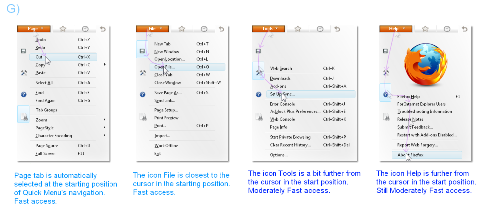
There are four icons within the Secondary Bar. They are File, Tools, Help and Page. Page is a merge of former View and Edit menus. I’ve joined these because it was required in order for whole idea to work out. It also allowed quicker access to all the commonly used options. The order of mentioned four options isn’t accidental by any means. But why Page option should be the one furthest away? Nevertheless it’s one of options that should be of quickest access. This is because Page menu will roll down instantly after starting whole menu G).
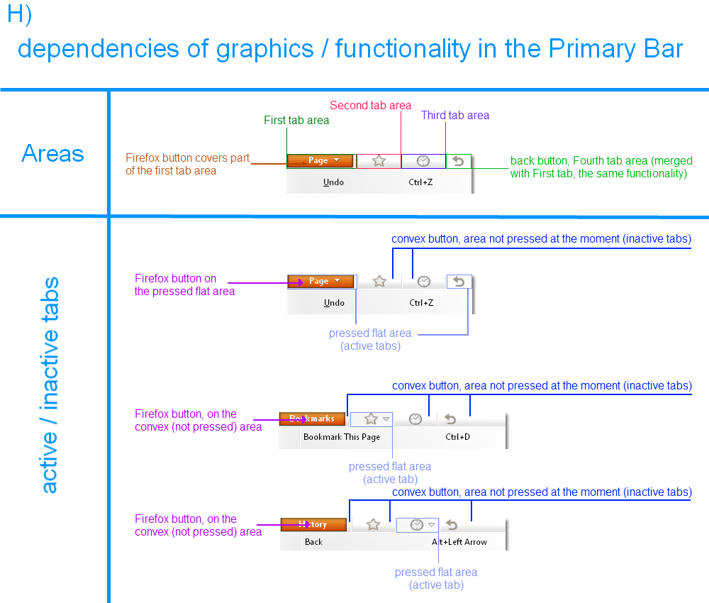
Below description regards to the graphic layout strictly. I made it this way not another having the ease of use in my mind. When Firefox button’s pressed the first Primary Bar’s option as well as Get Back to Start button are highlighted (pressed) automatically H). When this menu rolls down Page option is selected by default so that it’s one of the quickest access.
First option from Secondary Bar is File. Access’s nearly as fast, because File icon’s placed at the top, closest to Firefox button. The icon, as well as the area around are active, so that in order to roll down the File menu you just need to move the cursor close to the proper icon. G)
Access to the Primary Bar’s options – Bookmarks and History – as well as the Secondary one’s – Page and File – is instant. A little bit longer will it take in case of Tools and Help options , however it can certainly be counted as quick access one. It’ll require slightly longer mouse move in order to access Tools, and the longest one to find Help. However, straight down movement’s always fast and you just need to point the cursor on the option to roll down the menu. Active areas around the icons are bigger than the smallest buttons in current Firefox beta menu. Icons are smaller, yet active areas are the size of a standard button E) G).
As soon as you point certain active area a menu rolls down so that first option from the top of each given menu is on the same level as the cursor. Regarding to the Help menu options, I’ve placed options within so that the top of the column is also on the same level as cursor, however it caused an unsightly gap to occur, so I decided to put an aesthetic Firefox logo in there.
All active areas and buttons are quite a small ones, so I couldn’t put the titles on them. I considered this a drawback, therefore within the Firefox button I decided to place adequately changing titles of currently active options. As the menu’s rolled up the orange button’s got Firefox title, however in the moment when the button’s pressed it’s title turns to Page. Of course as follows, if we move over Bookmarks there turns up a Bookmarks title, if History then History etc. I)
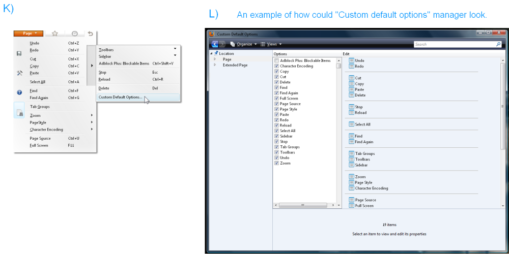
Merger of View and Edit resulted in a menu of huge size. Having that in mind and trying to make it more lucid, more compact I divided Page into separate Page and Page Expand menus. J) The second one that I mentioned is accessed through additional button situated on the right side. Additionally I provided Page menu with Custom Default Options entry K), which starts customization manager L , where users can modify Page menu just as they like it M). I personally think that’s a beneficial idea, because it’s the only new option within Quick Menu, which bases primarily on navigation and quick access drawn directly from old and appreciated menu bar.
Weakest point of Quick Menu in regards to Firefox 4 Beta is the quickness of access to Start Private Browsing option. It turned out this way because the mentioned option is situated as one of few most important ones in Mozilla’s menu. Quick Menu preserves classic category set from menu bar, therefore Start Private Browsing remained within Tools’ content, to which access isn’t as fast as in case of menu bar. In order to turn the situation to benefit Quick Menu more a certain modification shall be incorporated. If you click Firefox button one time – Quick Menu expands normally. However new addition is that, when you double-click Firefox button the menu will expand with Tools option selected. Thanks to that access to Private Browsing will be as fast as in menu bar, just slightly yielding the Firefox 4 beta menu.
Proper system of options’ titles display will provide quickness of operating during the navigation process. Difficulty that’ll be ought to faced when coding the menu is fact, that options within Quick Menu are different in size. Reaching an option, of which buttons or icons are placed further away, often requires moving the cursor over tabs situated on the way. Having quickest possible access in mind the reaction time after moving the cursor over any tab/icon has to be instant. E.g. if you’d want to reach Help option you’ll have to move the cursor over File and Tools. In case of File there’ll be no problem at all, however Tools option’s wider than other Secondary Bar options.
It’ll cause that when moving the cursor over the Tools icon the menu will expand and then roll back when we point the cursor on Help, which has narrower menu. Display, expanding and rolling back of an option’s menu will extend the time of access and also this effect will be rather unsightly, as the menu’s width will change during the navigation. In order to avoid such a situation the two-stage display system will be incorporated N). Nearly all Secondary Bar options are the same size. So that it’s needed to code the program in the way that when certain option’s menu is activated only it’s content will change. The Tools option makes an exception as it’s a little bit wider. During crossing its active area, just as in case of other ones, its content will display instantly, but the menu’s width will stay the same as other options’. It’ll look like Tool’s option content will be a bit cut, however it’ll expand with a certain delay. Thanks to that, when moving cursor through the Secondary Bar’s options to desired one below, the process of menu’s content change will go on smoothly.
Primary Bar may be equipped witch such a system as well. When selecting given tab menu will adjust its content within the size of Page’s menu. It’ll display the content fully with a certain delay, which will disable the menu from expanding during the navigation process, so it expands only when cursor’s pointed on the icon. Addition in regards to Secondary Bar is the fact, that when sliding down whole cursor on given option (Bookmarks, History) the menu will expand immediately. For Secondary Bar’s options the only determinant for the extend’ ll be the delay time. It’s been solved that way because only menu that’ll expand in Secondary Bar is Tools’ option. Slight difference between option’s menu in a standard and “cut” state and attempt of disabling random menu’s extension has been the cause of introduce such variety.
What made me to create the Quick Menu project is fact that I’d personally like to use a Firefox browser that merges new, less large layout, with old menu system’s functionality.
I don’t like the choice between new, modern looks and former menu qualities such as quick access, ease of use and clarity. Also I know from my forum and community activity that I represent a number of people that share my opinion. Many people believe that menu bar is irreplaceable in it’s ease and quickness of use.
My goal was to find a way to quickly access all the options within the one button only. I personally think that the goal’s been achieved and the idea would be easy to incorporate. I would be extremely happy if this simple idea would find it’s place as another alternative available to be chosen by Firefox’s users.
***options in my presentation mean items ; )









Awesome article.
Thanks for your marvelous posting! I definitely enjoyed reading it, you can
be a great author. I will make sure to bookmark your blog and will eventually come back in the foreseeable future.
I want to encourage continue your great work, have a nice afternoon!
These are truly great ideas in on the topic of blogging. You have touched some good points here.
Any way keep up wrinting.
Thanks for sharing your thoughts. I really appreciate your efforts and I will be waiting
for your fufther write ups thanks once again.
Great post. I used to be checking continuously this weblog and I’m inspired!
Very useful information specially the closing section 🙂 I take care of such info a lot.
I was looking for this certain info for a very long time.
Thanks and good luck.